

Year: 2017 – 2018 ■ Time span: 1 year ■ Product launch: 2018 ■ Type: realization - solo designer
Recognition: VVB 2017 - 1st prize - selected design and cooperation contract, DESIGN.S 2020 - featured project, poster exhibited
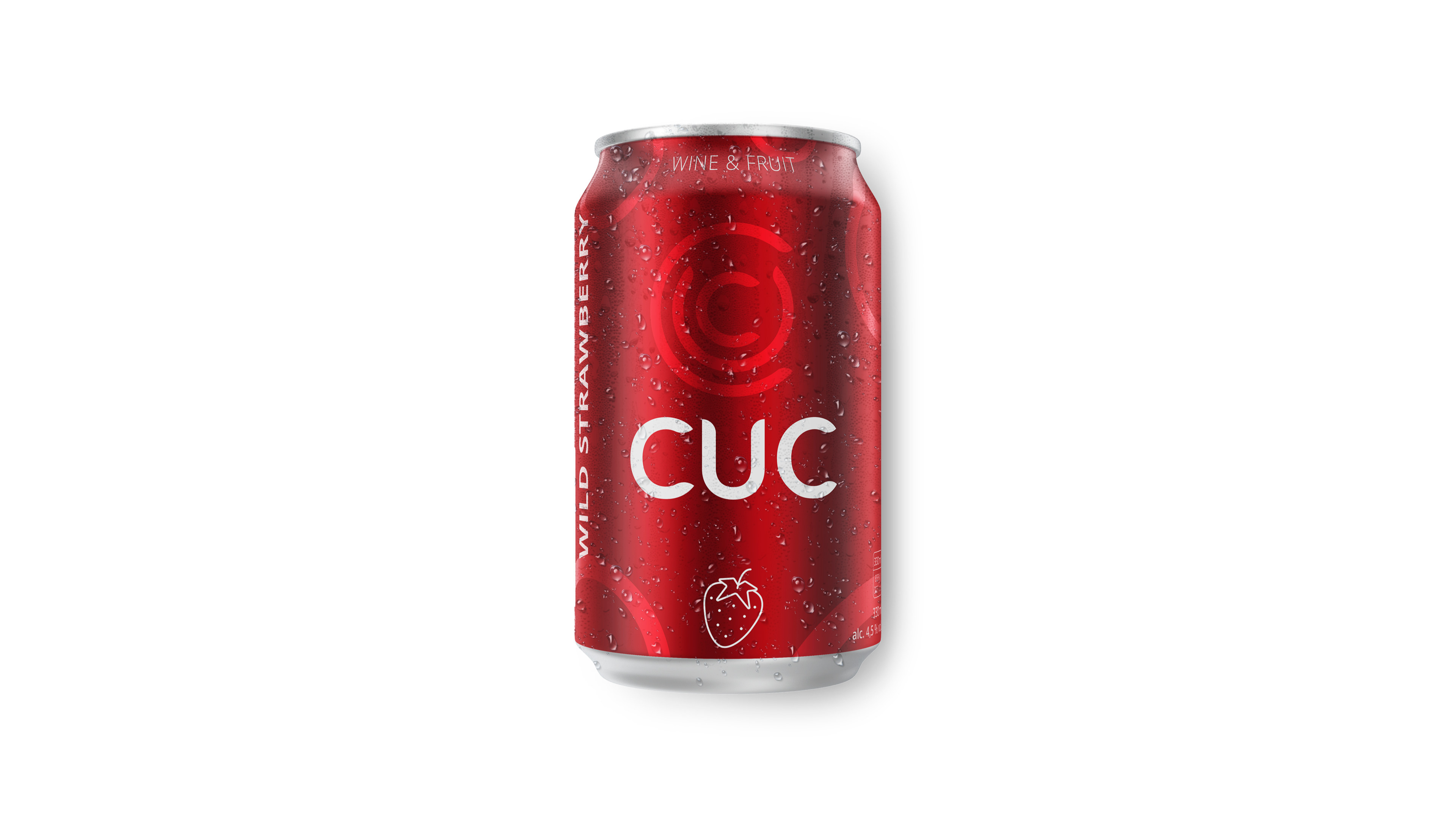
The name, which is resounding and easy to remember, is attractive to whoever hears it. Vivid monochrome and yet simple minimalistic packaging design reflects richness of the taste and the quality of all ingredients which are mixed together. Fizziness of each sip is mirrored by the circle - the main graphic element of the whole design, it symbolizes refreshing sparkling bubbles and berries of grapes and fruits which are main ingredients of this wine spritzer. It is the simplicity and the beauty of details that makes the concept unique and eye-catching. Each fruity flavor of the beverage is distinguished by the specific color of the packaging, which represents the color of fruit. Thanks to the minimalist visual style, its application is possible for any product and merchandise associated with the brand. Products and the brand were introduced to the public at the international fair Wine Prague 2018.
IDENTITY PRIMARY LOGO

IDENTITY LOGO VARIANTS

IDENTITY PRIMARY LOGO BACKGROUND COLORS

IDENTITY VISUAL ELEMENTS AND TYPOGRAPHY


CAN WILD STRAWBERRY - PICTOGRAM, COLORS, LAYOUT, VISUALIZATION


CAN CRANBERRY - PICTOGRAM, COLORS, LAYOUT, VISUALIZATION


CANS WILD STRAWBERRY AND CRANBERRY - VISUALIZATION

BOTTLE CONCEPT - SLEEVE - VISUALIZATION


BOTTLE MULTIPACK - 6 BOTTLES

BOTTLE BOX - 24 BOTTLES

PRODUCT PHOTOS CANS


PRODUCT PHOTOS TRAYS


HERO IMAGES ENVIRONMENTS


